Lay-out
Horizontale lay-out
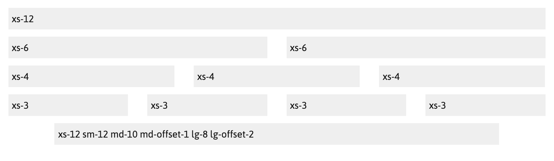
Om structuur en consistentie te creëren wordt voor de horizontale verdeling de 12 columns structuur uit Bootstrap 3 gebruikt.
12 columns
Column width auto
Gutter width 32px (16px on each side of a column)
Breakpoints
Extra small (mobiele telefoons) smaller than 768px
Max container width none (auto)
Small (tablets) bigger or equal to 768px
Max container width none (auto)
Medium (desktops) bigger or equal to 992px
Max container width 922px
Large (desktops) bigger or equal to 1200px
Max container width 1152
Verticale lay-out
Voor de verticale layout en hiërarchie wordt het 8px grid gebruikt. Het 8px grid betekent het volgende: Gebruik increments van 8px om de grootte van en ruimte tussen de elementen te tonen op een pagina. Dus height, width, padding, margin bestaan allemaal uit increments van 8.
Voorbeeld grid layout